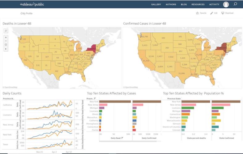
NACOGDOCHES, Texas - This semester’s special-topics class in business communication at Stephen F. Austin State University started out as a crash-course in data visualization, with students tracking financial and logistics information as well as the occurrence and location of wildfires, both nationally and in Texas, using Tableau software.
A data junkie who has made a career out of turning opaque statistics into usable business intelligence, Dr. Jamie Humphries, associate professor in the Rusche College of Business, is at his best when tracking something big, something arcane that can be polished, packaged and brought to the conference-room table.
So, it was no surprise that when COVID-19 emerged as an all-consuming pandemic generating a global avalanche of data, that Humphries would realize the opportunity for his students. Quickly plugging into the public Johns Hopkins University database, continually updated with correlated data from 30 global sources, Humphries asked his students to create custom, interactive COVID-19 dashboards.
Once the basics were in place, students were asked to be inventive, to start benchmarking and tracking adjacent data like Wall Street trading to see which stocks crash and those that sizzle during a pandemic, fever charts for hotel stays and, of course, the virus’ curve and its associated death and infection rates. The more granular the better.
Though the COVID-19 project was not on the syllabus at the beginning of the semester, it’s going to be a graded assignment. And it’s also providing a golden opportunity for students to experience what it’s like in the private sector post-graduation.
“You have to pivot,” Humphries said. “You have to find something new.”
Creating customized dashboards to track a virus the size of COVID-19 has been great for the three business and two forestry students enrolled in this semester’s class. By the time it’s over, they should be qualified to take the Tableau software exam for desktop specialist and be halfway through their preparation to qualify as a certified associate, both sought-after credentials in multiple disciplines.
Humphries, in only his second semester at SFA, said the COVID-19 project has tapped into the best impulses of his students.
“These students are a lot smarter than what we give them credit for, and they can be creative,” Humphries said. “You don’t have to ask them to do it. They just do it.”
Once COVID-19 transitions into recovery and the data becomes historical, Humphries said it will still have a great deal of value for students learning the foundations of data visualization. He plans on returning to the pandemic issue, and introducing new topics, this fall.
Regardless of the topic – pandemic, the stock market, wildfires or the opioid crisis – the goal of data visualization is always the same.
“Take data and turn it into a story,” Humphries said. “No one wants to look at a spreadsheet.”
To see Humphries discuss his COVID-19 tracking process with business students, visit bit.ly/2Ll697W.
 Axe ’Em, Jacks!

